HTML
Learn how to update HTML and listen to user interactions.
Overview
In a web application, one of the most common needs is to listen to user interactions and then update the page.
Let's say you want to create a page that counts clicks like the following: (click the +1 button):
With native HTML (DOM) APIs, you might implement this widget like:
<div id="my-counter"></div>

<script type="module">
    // Get the counter element.
    const counter = document.getElementById("my-counter");

    // Store the state of the widget.
    let count = 0;

    // Initialize the HTML within the widget.
    counter.innerHTML = `
        Count: <span>0</span>
        <button>+1</button>
    `;

    // Listen to when the +1 is clicked.
    counter.querySelector("button").addEventListener("click", function(){

        // Update the HTML.
        counter.querySelector("span").textContent = (++count)
    })
</script>
This implementation uses addEventListener() to listen to user interactions (clicks) and
.innerHTML and .textContent to update the page. CanJS removes the need to
call these native DOM APIs directly, reducing the amount of code you have to write. But more importantly,
CanJS will improve this code in other ways:
- It will manage state better.
- It will be easier to test.
- Multiple counter widgets can be created easily.
In CanJS, widgets are encapsulated with custom elements. Custom elements allow us to put an
element in our HTML like <my-counter></my-counter>, and the widget will spring to life.
Component is used to create custom elements.
The following implementation uses Component to create the counter functionality above. This implementation:
- Includes a
<my-counter>element in the page's HTML. - Defines a
<my-counter>Component.
<!-- Adds the custom element to the page -->
<my-counter></my-counter>

<script type="module">
import { Component } from "can";

// Extend Component to define a custom element
Component.extend({

    // The name of the custom element
    tag: "my-counter",

    // The HTML content within the custom element.
    //  - {{count}} is a `stache` magic tag.
    //  - `on:click` is a `stache` event binding.
    view: `
        Count: <span>{{count}}</span>
        <button on:click='increment()'>+1</button>
    `,

    // Defines a DefineMap used to control the
    // logic of this custom element.
    ViewModel: {
        count: {default: 0},
        increment() {
            this.count++;
        }
    }
});
</script>
You might have noticed that Components are mostly 2 parts:
- A stache view that specifies the HTML content within the custom element. In this case, we’re adding a
<span>and a<button>within the<my-counter>element. - An observable ViewModel that manages the logic and state of the application.
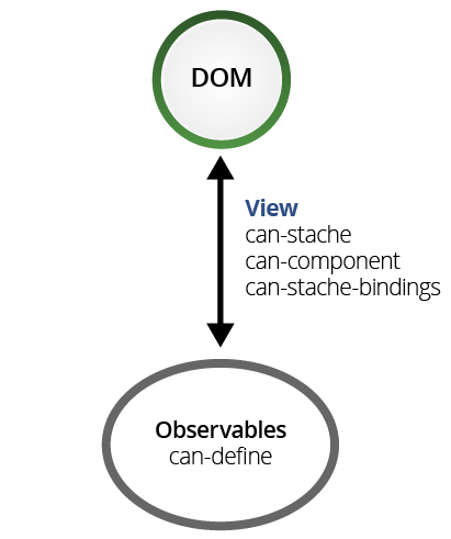
These work together to receive input from the user, update the state of the application, and then update the HTML the user sees accordingly. See how in this 2 minute video:
Component uses stache to update the HTML and stacheBindings to listen to user interactions and pass data between components. The remainder of this guide breaks down these pieces and goes into more detail about how Component works and how to use it.
Stache templates and bindings
can-stache is used to create HTML that updates automatically when observable state changes. It uses magic tags to read values and perform simple logic. The following are the most commonly used tags:
- {{expression}} - Inserts the result of
expressionin the page.Count: <span>{{ count }}</span> - if - Render the block content if the expression evaluates
to a truthy value; otherwise, render the inverse content.
{{# if(count) }} Count not 0 {{ else }} Count is 0 {{/ if }} - {{#is(expressions)}} - Render the block content if all comma seperated expressions
evaluate to the same value; otherwise, render the inverse content.
{{# is(count, 1) }} Count is 1 {{ else }} Count is not 1 {{/ if }} - for(of) - Render the block content for each item in the list the expression evaluates to.
{{# for(item of items) }} {{item.name}} {{/ for }}
can-stache-bindings are used to pass values between the DOM and observables and call methods on observables. Use it to:
Call methods on observables when DOM events happen. The following uses on:event to call
doSomethingwith the<input>’s value on akeyupevent:<my-demo></my-demo> <script type="module"> import { Component } from "can"; Component.extend({ tag: "my-demo", view: `<input on:keyup="doSomething(scope.element.value)"/>`, ViewModel: { doSomething(value) { console.log("You wrote "+value); } } }); </script>Update observables with element attribute and property values. The following uses key:to to send the
<input>’s value to the ViewModel’scountproperty when the user presses enter.<my-demo></my-demo> <script type="module"> import { Component } from "can"; Component.extend({ tag: "my-demo", view: `<input value:to="count"/> Count: {{count}}`, ViewModel: { count: "number" } }); </script>
- Update element attribute and property values with observable values. The following uses key:from
to update the
<input>’s value from the ViewModel’scountproperty.<my-demo></my-demo> <script type="module"> import { Component } from "can"; Component.extend({ tag: "my-demo", view: `<input value:from="count"/>`, ViewModel: { count: { // Makes count increase by 1 every // second. value(prop) { let count = prop.resolve(0); let timer = setInterval( () => { prop.resolve(++count); },1000); // Return a cleanup function // that is called when count // is longer used. return () => { clearTimeout(timer); }; } } } }); </script> - Cross bind element attribute and property values with observable values. The following uses
key:bind to update the
<input>’s value from the ViewModel’scountproperty and vice versa:<my-demo></my-demo> <script type="module"> import { Component } from "can"; Component.extend({ tag: "my-demo", view: ` <input value:bind="count"/> Count: {{count}} <button on:click="increment()">+1</button> `, ViewModel: { count: "number", increment() { this.count++; } } }); </script>
The following demo:
- Loops through a list of todos with {{#each(expression)}} -
{{# for( todo of todos ) }} ... {{/ for }}. - Writes out if all todos are complete with {{#is(expressions)}} -
{{#is( completeCount, todos.length )}}. - Updates the
completestate of a todo when a checkbox is checked and vice-versa with key:bind -checked:bind='complete'. - Completes every todo with on:event -
on:click='completeAll()'.
Components
The final core view library is can-component.

can-component is used to create customs elements. Custom elements are used to
encapsulate widgets or application logic. For example, you
might use can-component to create a <percent-slider> element that creates a
slider widget on the page:
Or, you might use can-component to make a <task-editor> that uses <percent-slider>
and manages the application logic around editing a todo:
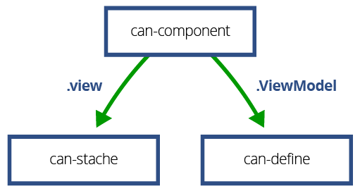
A can-component is a combination of:
- a DefineMap observable,
- a can-stache view, and
- a registered tag name.
For example, the following demo defines and uses a <my-counter> custom element. Hit the button
to see it count.
The demo defines the <my-counter> element with:
- The
Counterobservable constructor as shown in the Key-Value Observables section of the Technology Overview:import {DefineMap} from "can"; const Counter = DefineMap.extend({ count: {default: 0}, increment() { this.count++; } }); - The can-stache view that incremented the counter as shown in the beginning of this guide:
import {stache} from "can"; const view = stache(` <button on:click='increment()'>+1</button> Count: <span>{{count}}</span> `); - A can-component that combines the
Counterandviewas follows:import {Component} from "can"; Component.extend({ tag: "my-counter", ViewModel: Counter, view: view });
The demo then creates a <my-counter> element like:
<my-counter></my-counter>
So components are just a combination of a can-stache view and a DefineMap observable. can-component calls the observable a ViewModel. This is because CanJS’s observables are typically built within a Model-View-ViewModel (MVVM) architecture.

Instead of creating the view and view-model as separate entities, they are often created together as follows:
import {Component} from "can";

Component.extend({
    tag: "my-counter",
    view: `
        <button on:click='increment()'>+1</button>
        Count: <span>{{count}}</span>
    `,
    ViewModel: {
        count: {default: 0},
        increment() {
            this.count++;
        }
    }
});
can-component will create a can-stache template from a string view value and define a DefineMap type from a plain object ViewModel value. This is a useful short-hand for creating components. We will use it for all components going forward.
Passing data to and from components
Components are created by inserting their tag in the DOM or
another can-stache view. For example, <my-counter></my-counter> creates an instance of the
ViewModel and renders it with the view and inserts the resulting HTML inside the <my-counter> tag.
can-stache-bindings can be used to pass values between component ViewModels and can-stache’s scope. For example, we can start the counter's count at 5 with the following:
<my-counter count:from='5'></my-counter>
This is shown in the following demo:
can-stache’s scope is usually made up of other component ViewModels. can-stache-bindings
passes values from one ViewModel to another. For example, the <task-editor> component
connects its progress property to the value property of the <my-slider> with:
<percent-slider value:bind='progress'/>
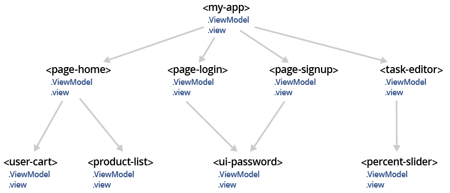
So on a high-level, CanJS applications are composed of components whose logic is managed by an observable view-model and whose views create other components. The following might be the topology of an example application:

Notice that <my-app>’s view will
render either <page-login>, <page-signup>,
<page-products>, or <page-purchase> based on
the state of its view-model. Those page-level components
might use sub-components themselves like <ui-password> or <product-list>.